


An Interior Design Expert Guides Us to Perfectly-Popping Color Combinations
Share
After years of gray and beige being the tones du jour for home decor, we’re pleased to be embracing color again. We asked the experts at Kurtz Collection a few questions about navigating the return of color for anyone ready to update their look.
Josephine Kurtz, lead designer at Kurtz Collection, shares a few tricks for decorating your home with vivid, modern color palettes — without making your rooms feel overly busy.
Neutrals have been a design standard for a long time now. Why is that changing?
While neutrals can have a calming appeal, decorating without color has become too sterile. We’re now seeing spaces imbued with individuality and personality, thanks to the intentional placement of more vibrant colors.
This isn’t a sign that you need to move away from monotone décor entirely. Instead, consider how adding even the smallest dash of strategic color might add to the feel and flair of your home.
Color can be a complex commitment. What’s an accessible way to get started?
Colors powerfully impact your mood. Harness that power, first, by noticing the colors you find yourself drawn to (again, and again, and again). Consider snapping a quick photo whenever you see something beautiful during your day, and check your camera roll after a week to see if you’ve subconsciously followed a color theme.
Ultimately, the same colors that bring you joy when you’re out and about will bring you joy at home.
Is there a specific way to mix colors in my home that looks considered and intentional?
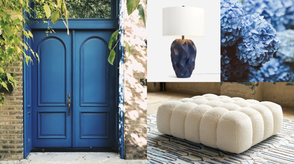
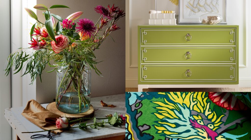
The 60/30/10 rule is an excellent rule of thumb: When designing your spaces, go for 60% use of one primary color, 30% use of a complementary secondary color, and sprinkle in 10% of a more fun or bold accent color.
Hint: Let your primary color stay relatively neutral, if this is your first foray into color.
The two 30-10 accents will help your space feel more balanced and dimensional. (It also lowers the pressure of having to pick just one accent shade!)
Do you have any suggestions for color combinations that are good places to begin?
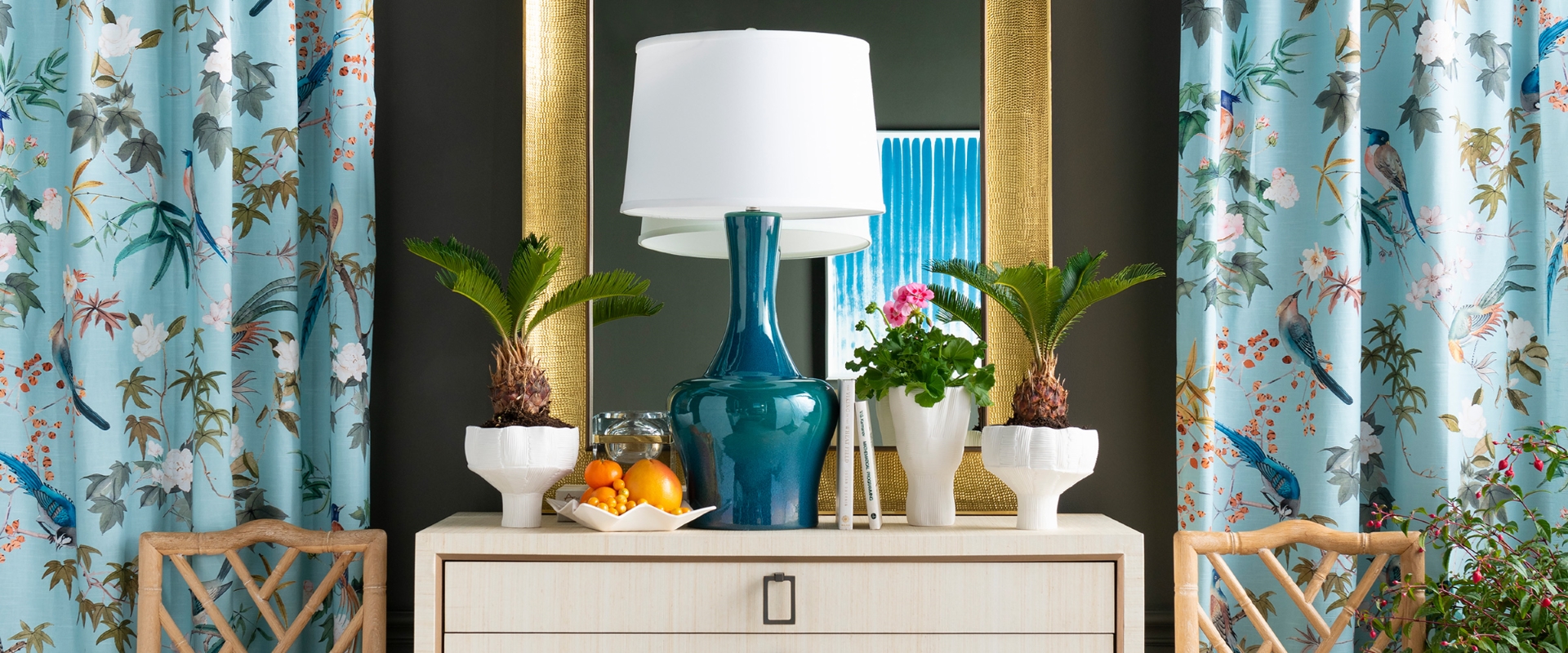
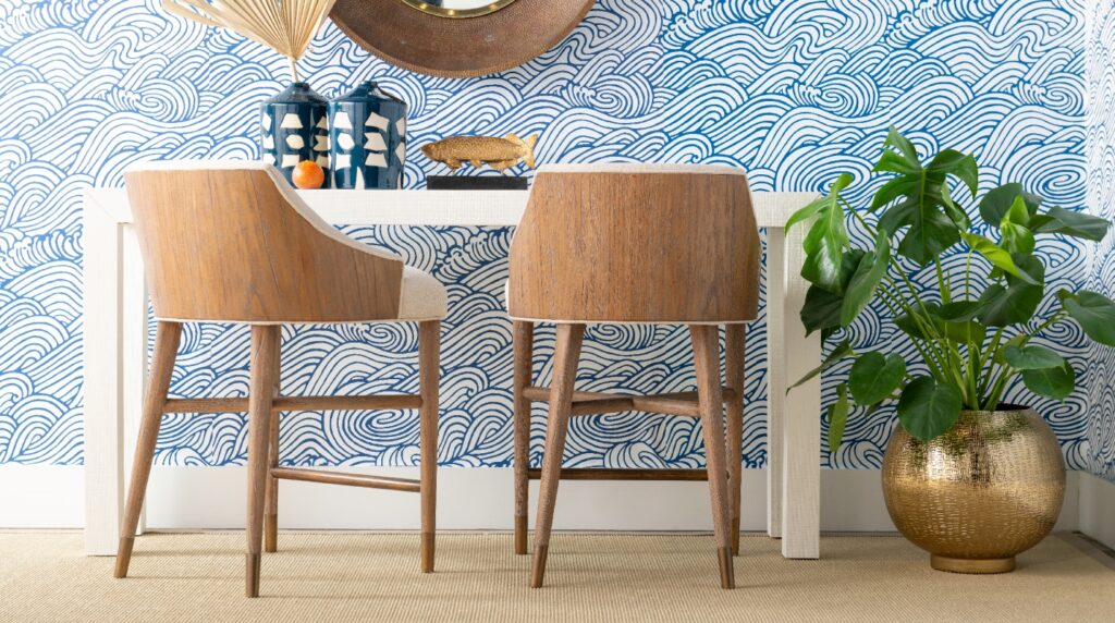
Blue and white is a classic combination for your base and secondary colors, if going too colorful is still a little daunting. Those colors are timeless, refreshing, and effortlessly elegant.
If I’m looking to design my home slowly, one room at a time, do you have tips for helping it all look cohesive while the update is underway?
Color can be artfully layered over time — and used creatively to tie together your space. Selecting base and accent colors that you already love and use can help. If you’re making a larger change in one room, picking up smaller accessories in your intended color pallet and placing them throughout your home can also provide cohesion.
At Kurtz Collection, you can visit and browse through a creatively-curated selection of fascinating furnishings and eye-catching antiques in either of our boutique showrooms. If you plan on decorating several rooms in your home over time, we can help you create a big-picture plan to support cohesion among your spaces. Connect with our team today by visiting Kurtz Collection online at kurtzcollection.com and New Moon Rugs at newmoonrugs.com. Or, stop in to browse our showrooms or chat with our Glen Mills and Wilmington specialists.
Visit Kurtz Collection online at kurtzcollection.com and New Moon Rugs at newmoonrugs.com. Or, shop the showrooms in Glen Mills and Wilmington.

Wilmington
1010 North Union Street, Wilimington; 654-0442
Glen Mills
529 Glen Eagle Square, Glen Mills, Pa; 484-800-4557